

Table of Contents
1. Overview
-
Team
-
Timeline
-
Goal
-
Tools
-
Skills
2. Research
-
Content Audit
-
Employee Survey
-
Severity Rankings
3. Mood Board
4. Low- Fidelity Wireframes
5. User Flows
6. Style Guide
-
Coloring
-
Logos & Images
-
Typography
-
UI Elements
-
Stylists
7. High- Fidelity Mockups
8. Summary

Overview
Dreamclinic Massage is Seattle’s best medical massage clinic- award winning and female owned. With 3 locations in the Pacific Northwest and a vast team of on- site employees, the company needs a way to uphold business standards and share company information quickly and easily.
Dreamclinic’s Intranet has been around for years, but has needed a “face lift” for most of its lifespan. Employees who have been with the company from day one do not even remeber the last time it was a usable tool. I’m Jessica, a Massage Therapist transitioning to User Experience Design, and I saw the solution to this problem as a mutually beneficial opportunity for everyone involved. After pitching my “New Year, New Intranet” plan to execute a revamped employee portal, the management team was elated to get started!
The Team

Jessica Berry (me)
-
UX Designer
-
Information Architect
-
Lead Massage Therapist

Roxanne Brunsting
-
Project Manager
-
Content Editor
-
Director of Operations

Dreamclinic's Admins
-
Content Populators
-
Staff and Clinic Assistance
The Project
Timeline
7 Months
August 2022- March 2023
Goal
Dreamclinic Staff need a way to easily access company information in order to encourage collaboration and promote transparency and clarity.
We will know we have accomplished this when we have added resources for professional development and training, company policies, and created space for communication and collaboration.
Tools
Google Sites - Intranet host
Figma - design tool
Zoom - team meetings
Research

Content Audit
To start the project, I did a content audit to present to the Dreamclinic Management Team. This version was last updated in 2021.
*some information has been blurred to maintain privacy
1. Homepage
clashing alignments and styles of text
layout is unorganized and unaligned
Lacking strong sense of visual hierarchy

Employee Survey
After conducting the content audit, an employee survey was created to better understand what employees wanted to get from a revamped Intranet. Due to company budget, an unmoderated remote survey was the best option to gain qualitative and quanitative data.
Questions
Q1
How long have you been working at Dreamclinic?
-
<1 year
-
1 - 2 years
-
2 - 5 years
-
5 + years
Q2
What are some Dreamclinic resources you would like to have easier access to?
Q3
When you are shopping or researching online, what brands or sites come to mind that have a great user experience? What makes the user experience a good one? (include any examples)
Q4
When you use a website or app, what are some key features that make the experience enjoyable for you? (Check all that apply)
-
A good first impression
-
Ease of use
-
Optimized for mobile
-
Calls to action are obvious (you don’t have to search for buttons, etc.)
-
Aesthetically pleasing
-
Contact Page
-
Relevancy & consistency
-
Clear visual and descriptions
-
Other
Q5
What social media platform(s) do you enjoy using most? (Check all that apply)
-
Facebook
-
Instagram
-
Twitter
-
LinkedIn
-
Reddit
Q7
What does the term "positive intent" mean to you?
Q8
How can we create more space for fun at Dreamclinic? (Check all that apply)
-
Group events
-
Clinic events (massage/ other learning opportunities)
-
Classes
-
CE (continued education) opportunities
-
A DC social platform
-
Other
Q6
In your own words, how would you define “community”?
Q9
What information/resources are vital for your success in your role at Dreamclinic?
Q10
What are your go-to resource(s) for your massage practice? Why?
Q11
Is there anything else you'd like to share? (ALL feedback is helpful! Feel free to add any hopes or dreams for what you would like to see on our Dreamclinic staff-only portal/intranet)
Summary of Findings
-
a walkthrough of clinic processes
-
a calendar for schedule management, time off requests, employee events and meetings
-
contact information
-
a search bar
-
classes and continued education (CE) options
-
a resource page
-
options for massage licensure insurance
-
a social platform/ message board
Severity Rankings
Using the data collected from the employee survey, the management team and I created Severity Rankings to prioritize what was necessary and doable within our 6 month timeline.
Below are the Severity Metrics, followed by observations from employees, their severity, and the actionable recommendations made to elevate their experience.
Severity Metrics
0 = I don't agree that this is a necessary feature at all
1 = Cosmetic only: need not be added unless extra time is available on project
2 = Minor problem: adding this should be given low priority
3 = Major problem: important to add, so should be given high priority
4 = Required: imperative to have this before product can be released

Mood Board
In order to keep Dreamclinic’s core values in mind, I created a mood board to ground our design decisions.

Low- Fidelity Wireframes
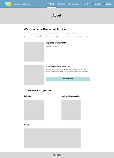
Using the Mood Board to stay grounded, the findings from the Employee Survey, and keeping Google Site’s layout in mind, I put together low- fidelity wireframes for the main pages of the Intranet- About, Welcome, Resources, and Contact.

About Page
This page is the introduction for new and returning users of the Intranet, giving a brief overview of what they can expect to interact with. Here, employees will be able to see what company events are coming up (meetings, on- site opportunities, classes, parties, etc.), they can track where clinic and work related problems are in their resolution process, as well as stay up to date on the latest news from Dreamclinic.
Key features on this page:
-
an events page/ calendar
-
schedule management & coverage requests
User Flows
With approval from mangement on the wireframes, user flows were made to layout the interactivity of each page.

Style Guide
Branding consistency is key to a beautiful, usable design. The previous version of the Intranet was clearly lacking the structure of that prior, so I developed a Style Guide based off of the guidelines and restrictions of Google Sites, in keeping with Dreamclinic’s brand. This also aided in hand- off.
Coloring
Primary Colors:

Secondary Colors:

Error & Call to Action (CTAs):

Logos & Imagery
Logos:
Images:
Suggested Page Headers

Content Image Guidelines

*content images should be no wider than 6 columns*
Typography

Rules & Guidelines
-
All text is left aligned with the exception of Navigation Page Headers
-
Titles, Headings and Subheadings should share the same number of rows of text- adjust sizing If needed (example below)

-
Subheadings for content should be above imagery (or other applicable content)
-
Subheadings to list employees or people should be below imagery (or applicable content)

User Interface (UI) Elements
Links:

Rules & Guidelines
-
All CAPS
-
Styling = Filled
-
for EXTERNAL links
-
Links to a subpage of the main navigation pages
-
Keep original colors- #027BD/ Dream Blue, #63B89B/ Peppermint (google changes to #000000/ Black when link is attached to text)
-
For INTERNAL links
Collapsible Groups:

Styling Guidelines
-
Style 1 is used for EVERYTHING, with the exception of...
- Calls to action (style 2)
- FAQs (style 3)
.png)
-
Header Types:
- Navigation Pages are the only headers with images
- Navigation subpages use text only (Title 2- see in “Typography”)
High- Fidelity Mockups

Summary
Hand Off = January 20th, 2023
Launch = March 20th, 2023
New and long- time employees are optimisticly regaining an efficient, thorough, communicative work environment.
Many employees have reached out with their grattitude, and we continue to recieve feedback and ideas on how to optimize employee functions and daily tasks. We plan to further improve upon Dreamclinic’s communication for the company to prepare for continual expansion in the Pacific Northwest.
Challenges
The biggest challenge in this project was the company budget. Dreamclinic is still a small- scale business, working on growing. Therefore I was only allotted 2- 4 hours per week to work on it, which also included any meeting time with Roxanne, the project manager.
The other continual challenge would have to be the site’s host. Although using Google Sites for this project made my job easy, it did come with several restrictions and creative limits. Google allows you to create a color palette, but restricts it to 3 colors. The preset components made customization difficult and required workarounds throughout the design process.
Lastly, communication. The project manager of my team wears several hats within the company, so her time is often spread thin. These conflicts with time made updates difficult to keep consistent. Thankfully, we were able to make our BRD and email work as a passive form of communication and made our zoom meetings shorter for more pressing issues and updates.
Prosperities
Though I did highlight Google Sites heavily as a challenge, it was also a very easy tool to work with. With the preset components, designing page layouts was quick. This ended up being a huge help to my weekly work time restrictions.
We were able to repurpose a lot of elements from the original site, last updated in 2021. As I mentioned in the Overview, the site just needed a facelift. The content itself wasn't the issue, just the organization and hierarchy of the content.
My heart was so full to have the opportunity to pitch and work on this project. I loved being part of helping better company communications, refining standards and branding, and getting to learn more about the layers of the individuals in clinical massage care to better understand their needs.
Looking to the Future...
This project has officially been handed off to the management and administration team. They have the updated style guide to reference for updates, and I am available for further consultation as needed.
